


A modal needs a header, a body, and actions. Everyone knows this. It’s in the docs. It’s in the Figma file. It’s in the component definition.
And yet, two days ago, someone shipped a modal without action buttons. The PR got approved. QA didn’t catch it. Now it’s in production, and a user is staring at a dialog box with no way to proceed.
This happens because design systems have opinions they don’t enforce. We write the rules down. We trust people to follow them. And when they don’t, we call it a “process problem” and move on.
Most design systems don’t work like infrastructure. They work like hope.
We publish components, write docs, and pray teams wire them up correctly. When they don’t, we discover it in QA… or production. And now we’re entering a world where the “team” using your components might be a human, an AI agent, or both. If your design system doesn’t enforce contracts, it isn’t infrastructure. It’s a library people interpret however they want, and you spend the next six months arguing about what “correct” means.
I’ve written before about the shift from implicit knowledge to explicit contracts. That shift isn’t optional anymore.
The infrastructure mindset
Backend teams would never ship an API that accepts whatever it’s given and “does its best”. They validate inputs. Databases enforce constraints. Infrastructure rejects malformed requests before they can cause damage.
UI rarely gets the same treatment. We tolerate ambiguity that backend teams would never accept.
Nathan Curtis has been pushing back against this for years, advocating for components as structured data. His work on component definitions is basically “design tokens, but for components”: anatomy, props, styles, variant behaviour, all expressed in neutral formats like YAML or JSON. When the component is a spec, you can validate it.
His Anova plugin takes this further, analysing Figma assets and deriving what’s invalid from the structure, including a summary of invalidVariantCombinations. The system already knows what’s invalid. We’re just not using that output to enforce anything.
But we could.

Is your design system ready for AI? AI agents are already consuming design systems. Find out if yours is structured to be understood by them.
Validation rules are encoded design decisions
A healthy design system validates at three points, all with the same goal: catch problems before users do.
- Design-time: Figma linting, specs-as-data, structured component definitions
- Build-time: TypeScript constraints, ESLint rules, schema validation in CI
- Runtime: dev-only guardrails with human-readable errors
Required children
Some components aren’t “anything goes” containers. They expect a specific structure.
A modal without actions is a bug. A table without headers is a mistake. A form without inputs is just a box. Instead of burying that in docs, encode it. Modal requires ModalHeader, ModalBody, ModalActions. If the structure is wrong, throw a dev-time error or render a debug placeholder.
In my piece on agent-ready design systems, I called these “composable contracts”: components that describe their relationships like a RESTful API with required parameters. The same principle applies whether the consumer is a developer or an AI agent.
Forbidden combinations
Some prop combinations don’t make sense together.
A common one: loading and disabled. In many systems, loading implies disabled. You can’t click while something is in flight. So don’t allow both, and don’t leave it up to everyone’s personal interpretation.
In TypeScript, the never type makes this constraint explicit:
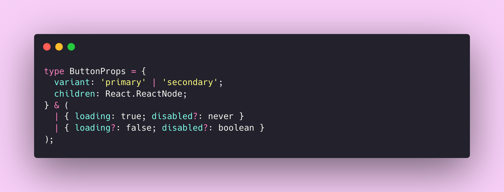
Try to pass both and the compiler catches it. The constraint lives in the type system, not in someone’s head.
State constraints
Some rules are harder to encode, but they’re often the ones that cause the most friction:
- Navigation that shouldn’t exceed a max item count
- A card footer that only accepts certain subcomponents
- A form that requires at least one input
- A destructive action that must include a confirmation pattern
Right now, these live in tribal knowledge. Someone remembers, or they don’t. Validation turns that into a contract.
Start small, but start
If this feels heavy, good. Infrastructure always feels heavy until the first outage.
Start with the components that people constantly misuse. The ones you dread reviewing. The ones where “just this once” happens every week.
A first rule: no inline styles on system components
Pick 3–5 high-usage components and start there. You’re not solving the universe, you’re carving a boundary.
Here’s a minimal example using no-restricted-syntax:
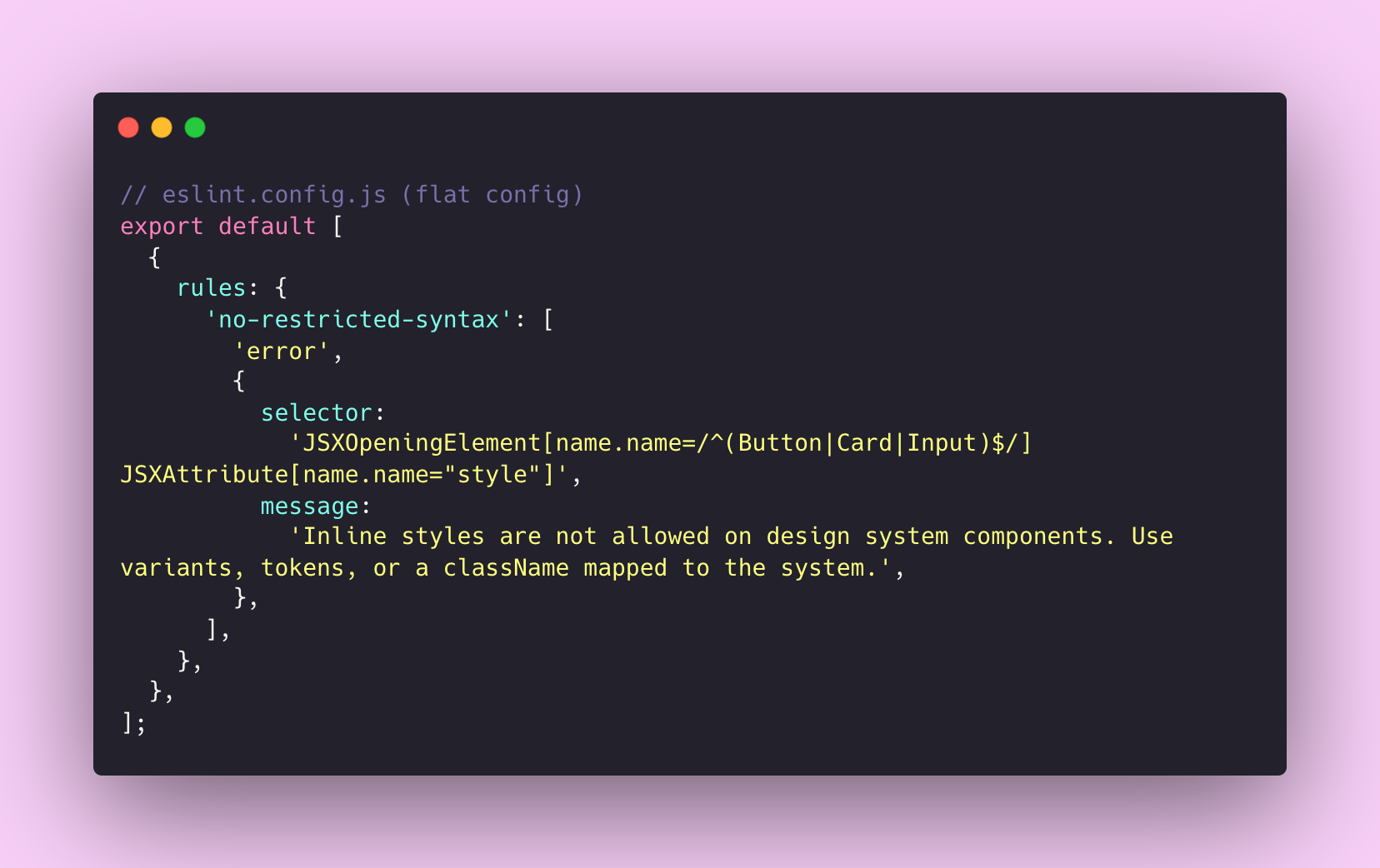
If you want something more maintainable, react/forbid-component-props from eslint-plugin-react is built for this kind of enforcement.
One thing worth remembering: the error message matters as much as the rule. Don’t just block the behaviour. Teach the alternative. The message is part of the product.
Why this matters more now
Humans can squint at a slightly-wrong implementation and “make it work”. Agents can’t. They need crisp structure.
I’ve written about how AI amplifies your design system, for better or worse. If your system is solid, AI makes it more powerful. If it’s inconsistent, AI makes that inconsistency impossible to ignore. Validation is how you make sure it’s the former.
Three signals I’m watching:
A protocol-level approach
Google’s A2UI treats UI as messages, not executable code. The client owns rendering. The agent can only request components from a client-supported catalogue. If the message doesn’t validate, the client rejects it and reports the error. The trust boundary is solved with schema and catalogue, not vibes.
Even if you’re not building agent-driven interfaces, three principles from A2UI translate directly:
- Publish a component catalogue. Name things once. Make “unknown component” a hard error, not undefined behaviour.
- Make composition explicit. Model parent-child relationships as a contract, not a suggestion.
- Separate structure from implementation. Let the system describe what appears. Let the client decide how it looks.
A tooling-level approach
The Storybook MCP server provides structured component context for AI tools, and enables an autonomous correction loop that can run interaction and accessibility tests. Once AI is writing chunks of UI, this stops being a “nice to have”.
A design-asset-to-data approach
Nathan Curtis’s work on component definitions and TJ Pitre’s FigmaLint both push toward the same idea: get validation into the design layer, before code is ever written. Errors compound as they flow downstream. Catch them early.
What this unlocks
Validation isn’t about slowing teams down. It’s about removing friction from things that shouldn’t require discussion.
- Faster PR reviews. Less bikeshedding about whether
CardFootercan contain aButtonGroup. The system has an opinion. - Fewer regressions. Constraints catch errors before they ship. That’s a QA cycle that doesn’t need to exist.
- Better agent output. Less ambiguity means AI tools generate code that actually works with your system.
Design system teams have historically positioned themselves as helpers rather than gatekeepers. I’ve written about this tension before, and I still agree with that instinct. Rigid enforcement breeds resentment and workarounds.
But validation doesn’t have to feel like policing.
Good validation feels like the strike zone: clear boundaries, consistent calls, and fewer arguments that waste everyone’s time.
If it’s important enough to document, it’s important enough to enforce.
The bigger picture
We’ve been treating design systems as libraries: collections of components teams can use however they want.
Maybe it’s time to treat them as infrastructure: systems that enforce contracts, validate input, and guarantee behaviour.
The tooling already exists. The patterns are proven. The only question is whether we’re ready to stop hoping and start enforcing.
Thanks for reading! Subscribe for free to receive new posts directly in your inbox.
This article is also available on Medium, where I share more posts like this. If you’re active there, feel free to follow me for updates.
I’d love to stay connected – join the conversation on X and Bluesky, or connect with me on LinkedIn to talk design systems, digital products, and everything in between. If you found this useful, sharing it with your team or network would mean a lot.

Member discussion