


I've audited a number of design systems, and one thing I've noticed is that teams tend to judge each other's component decisions without understanding the context that produced them. A modal that looks over-engineered from the outside is often a direct response to organisational realities that aren't visible in the code.
So the goal of this series isn't to find the best implementation – it's to understand what each team's decisions reveal, and to pull out principles that are worth carrying into your own work.
The modal is a good place to start – every system has one. The concept is simple enough that it barely seems worth comparing, which is exactly why the differences are instructive.
For this article, I spent time with four systems: Carbon (IBM), Material UI (Google), Polaris (Shopify), and Radix Primitives. One component, four genuinely different approaches. Here's what I found:
Naming is a semantic commitment
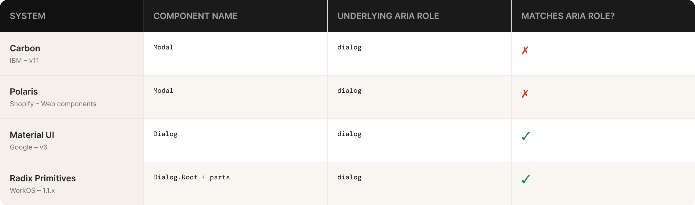
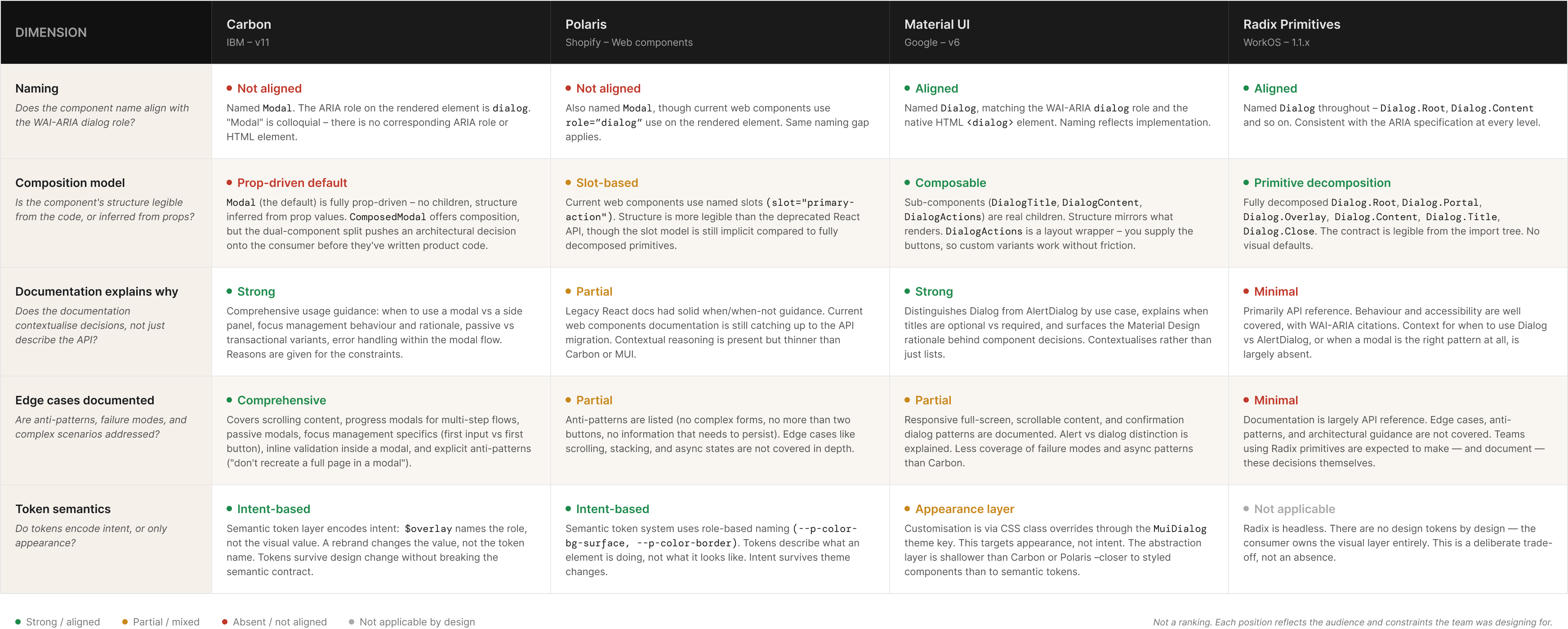
Carbon and Polaris both call it Modal. Material UI and Radix both call it Dialog.
That might seem like a stylistic choice, but it reflects something meaningful about how each team understands the component's purpose.
"Modal" describes a visual and behavioural pattern – it's a layer that sits on top of the page and blocks interaction behind it. "Dialog" describes an interaction contract. It's an exchange — the system is asking you something and waiting for a response. The WAI-ARIA specification, which all four systems claim to follow, uses the dialog role and maps to an HTML element of the same name. So "Dialog" isn't just a preference — it's the semantically accurate term within the accessibility model these systems are built on.
Radix and Material UI chose precision. Carbon and Polaris chose convention. Neither is wrong, but the implications run deeper than terminology.
An AI coding agent trained on web content has a much richer understanding of dialog than of modal. The former is an ARIA role, a native HTML element, a pattern with a formal WAI-ARIA specification, and years of documented usage. The latter is a colloquial term with no direct spec equivalent. When a system names its component Dialog, it's accidentally doing something useful: aligning its API with a vocabulary that machines understand well. Systems that use convention-based names are narrowing the signal, without usually meaning to.
This won't matter much to most teams right now. But as AI tooling becomes a primary consumer of design system APIs, naming choices that seemed arbitrary will turn out to have had real consequences.
Structure is the primary documentation of a contract
This is the most important thing I found comparing these systems, and it's worth stating plainly before getting into the detail.
Where a component expresses its structure is where it communicates its contract. If structure is defined through composition — through the nesting of sub-components that have explicit, named relationships — a consumer can understand what's expected by reading the import tree. If structure is defined through props, or passed implicitly as untyped children, a consumer has to read the documentation to understand what valid usage looks like.
That distinction matters for human developers. It matters significantly more for AI agents. But it also matters for the quieter, more common failure mode: a developer who doesn't read the docs.
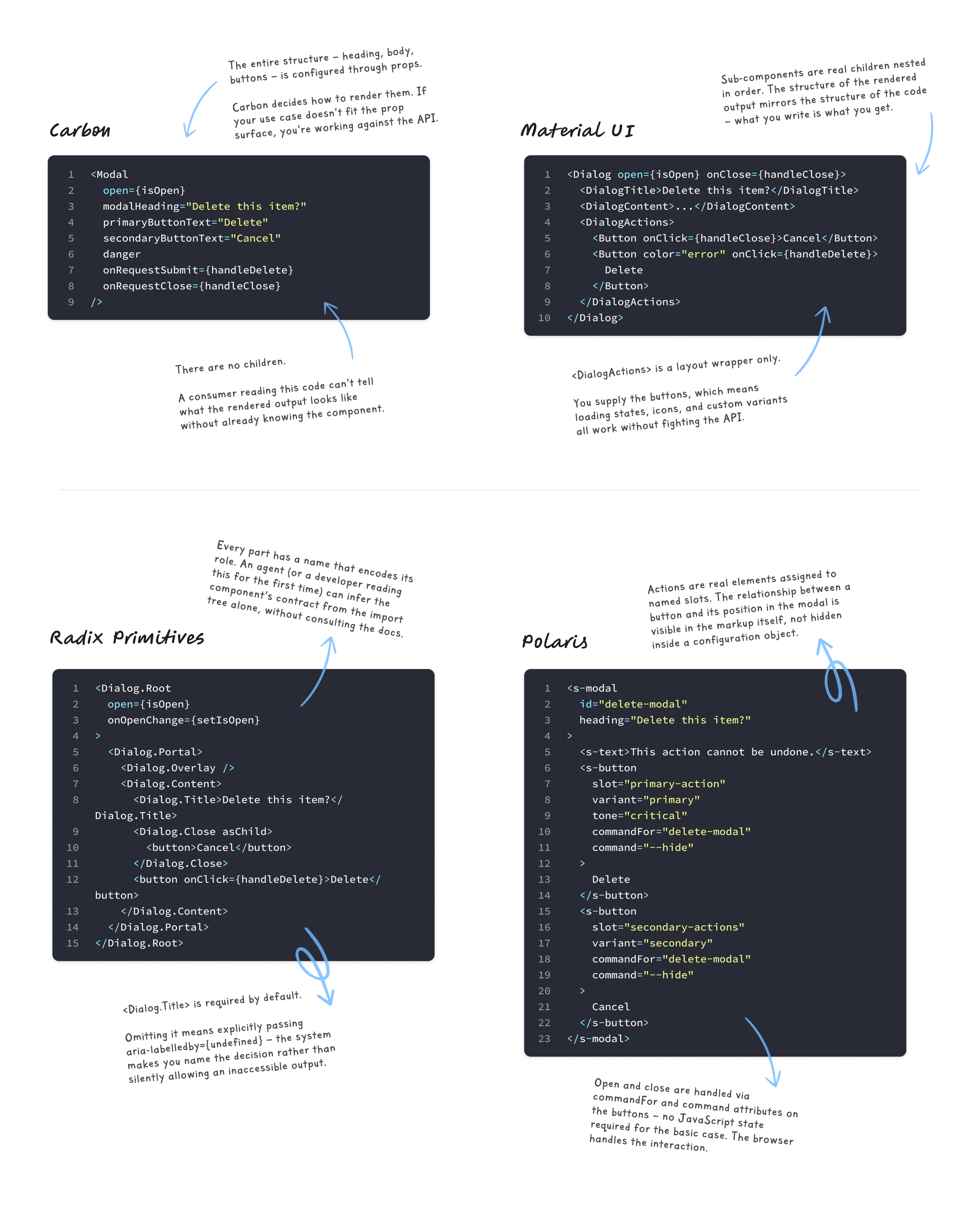
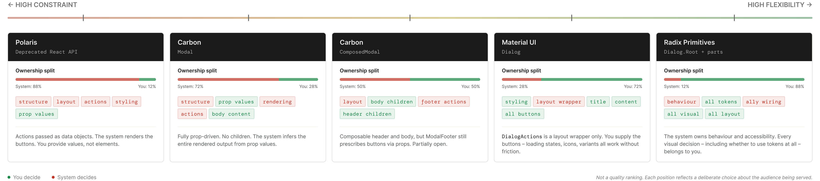
Radix takes the most explicit position. The Dialog isn't a component in the traditional sense. It's a set of primitive pieces with defined relationships: Dialog.Root manages state, Dialog.Trigger controls open/close, Dialog.Portal handles DOM placement, Dialog.Overlay is the backdrop, Dialog.Content is the container, Dialog.Title labels it for screen readers, Dialog.Description provides optional context, and Dialog.Close handles dismissal. Every piece has a name. Every name encodes a purpose.
The system provides zero visual styling and makes almost no structural decisions for you. The accessibility behaviour and keyboard interaction wiring is baked in, precisely implemented to the WAI-ARIA dialog pattern. Everything else is yours.
The cost is real. There's no default to reach for. A developer coming to Radix for the first time doesn't find a dialog component — they find a set of building blocks with an expectation that they know what to do with them. The payoff is that, for teams who do know what to do, the contract is legible without documentation.
Material UI sits one step back. The Dialog component has sub-components — DialogTitle, DialogContent, DialogContentText, DialogActions — and they're genuinely composable as children. DialogActions is a layout wrapper; you bring your own Button components. The system doesn't prescribe your action structure, but it gives you the scaffold. There's something to start from.
Carbon's ComposedModal follows a similar pattern, with ModalHeader, ModalBody, and ModalFooter as composable children. But the footer is where Carbon pulls back from full composition. ModalFooter exposes primaryButtonText, secondaryButtonText, and a danger boolean to control the footer buttons. You're not bringing your own buttons and placing them inside the footer. You're describing what the buttons should say and what state they should be in, and the component renders them for you. Even in the composable version, actions are still partially prescribed.
Carbon also ships a simpler Modal component where the entire structure is configured through props, with no sub-components at all. I'll come back to why that dual API is a problem.
Polaris's legacy React Modal passed actions as data objects:
<Modal
  primaryAction={{ content: 'Save', onAction: handleSave }}
  secondaryActions={[{ content: 'Cancel', onAction: handleClose }]}
>
You weren't rendering a Button. You were describing an action and the system decided what to render. That's a deliberate choice — it enforces consistency, every action in every modal looks the same across the entire platform — but it removes flexibility. If you need a loading state on your primary button, or a custom icon, or a button variant the API doesn't anticipate, you're working against the contract rather than with it.
As of 2024, that React Modal has been deprecated. Polaris's newer web components platform uses a slot-based approach, where buttons are passed as children into named slots:
<s-modal heading="Confirm deletion">
  <s-button slot="primary-action" variant="primary">Delete</s-button>
  <s-button slot="secondary-actions" variant="secondary">Cancel</s-button>
</s-modal>
The direction has shifted from data-driven configuration toward composition. The slot names still carry semantic weight — primary-action and secondary-actions make the intent explicit in the markup — but the consumer is now rendering real components rather than describing objects.
The problem with two components for one concept
Carbon's dual Modal and ComposedModal is worth dwelling on because it's a pattern I see in a lot of systems, and it tends to cause more problems than it solves.
The reasoning is understandable. Some consumers want something that works immediately. Others need the flexibility to customise structure. Carbon's response is to ship both and let teams choose.
The trouble is that this pushes a fundamental architectural decision onto the consumer before they've written a single line of product code. And in practice, teams almost always reach for the simpler option first. Modal is right there. It works. You can pass primaryButtonText as a string and get a button in the footer.
Then the first edge case arrives. You need a third action, or a button that starts in a loading state, or a custom footer layout. And you're migrating from Modal to ComposedModal mid-feature, which is exactly the friction the dual API was supposed to prevent.
The right answer to "some people need flexibility" isn't two components. It's a composition model that serves both audiences from the start. Material UI comes closer to this. DialogActions accepts any children, so the simple case and the complex case use the same structural model. You're not choosing between two different components, you're just choosing how much you put inside the one you already have.
Documentation reveals assumptions
What a team documents reflects what they assume you already know.
Radix's documentation is almost entirely focused on behaviour and accessibility. Every component part has a keyboard interaction table. The exact WAI-ARIA pattern is cited. Dialog.Title is documented as required for screen readers, and the docs explain precisely what to do if you need to visually hide it. There's no ambiguity about what the system expects from you.
What Radix doesn't document is when to use a Dialog versus an AlertDialog, which Radix provides as a separate component for destructive or irreversible actions. That choice is left entirely to the consumer. The implication is that you already understand the distinction between a general-purpose dialog and an alert dialog, and that you'll look it up in the WAI-ARIA spec if you need to. That's a reasonable assumption for Radix's audience. It's also a signal about who Radix is built for.
Material UI is more contextual. The documentation distinguishes between alert dialogs, confirmation dialogs, and simple dialogs, and explains when each is appropriate. There's guidance on when a dialog should have a title and when it shouldn't. That's design guidance embedded in a system documentation site, not just API reference. The difference matters: one answers "how do I use this?" and the other answers "should I use this, and in what way?"
Carbon is the most thorough. The documentation covers focus management, animation, scrollable content, and when a modal is appropriate versus a side panel or inline expansion. The system has clearly thought about the modal as part of a broader interaction pattern library rather than an isolated component. The gap is the Modal versus ComposedModal choice. For a newcomer, it's not clear which to reach for, and the documentation doesn't explain when ComposedModal's added flexibility is worth the added complexity.
I've found that the most revealing thing about a system's documentation isn't what it covers. It's what it assumes you already know.
Two ways to think about accessibility enforcement
All four systems document WAI-ARIA dialog pattern compliance. The more interesting question is how each one handles the case where a developer ignores the documentation.
Radix's Dialog.Title is effectively required. You can omit it, but doing so fires a console error in development – the system flags the missing label and tells you exactly how to resolve it. If you genuinely don't want a visible title, you wrap Dialog.Title in VisuallyHidden, or provide an aria-label directly on Dialog.Content. Either way, you're making an explicit, visible decision. The system won't stop you, but it won't let you ignore it either".
Material UI and Carbon both include DialogTitle and ModalHeader as recommended sub-components. Neither enforces their presence. You can render a Dialog or Modal without a title and the component will work normally. The accessibility responsibility sits in the documentation, not the structure.
I've come to think of this as the difference between accessibility as documentation and accessibility as architecture. The former trusts that developers will read and follow guidance. The latter accepts that many won't, and designs the friction accordingly.
For small, senior, careful teams, the documentation approach is usually fine. For systems that serve large organisations with many contributors, varying experience levels, and inconsistent code review, structural enforcement isn't pedantry. It's the only mechanism that works at scale.
The difference between overriding appearance and overriding intent
Most comparisons of design system token layers stop at "does it use tokens?" That question isn't particularly useful. The more meaningful one is what those tokens encode.
Carbon is the most thoroughly tokenised of the four. The modal overlay background, the container surface colour, the close button hover state all reference Carbon's token system directly. When you override a value in Carbon, you're overriding a token, and the change propagates wherever that token is used. Importantly, Carbon's token system includes a semantic layer — tokens like $overlay describe intent, not appearance. Overriding $overlay-01 changes what that concept means in your system. That's different from overriding a specific colour instance.
Material UI's theming system allows style overrides via the MuiDialog theme key. This gives you centralised control, but the mechanism is CSS class overrides applied through the theme object, not semantic token substitution. You can change how a dialog looks everywhere, but you're working at the appearance layer rather than the intent layer. The distinction matters when you're trying to express brand-level decisions consistently rather than just restyle a component.
Radix has no tokens because it's a behaviour primitive. You bring your own token system and apply styles however your project expects. This is genuinely useful for teams building a design system on top of Radix, which is an increasingly common pattern. There's nothing to fight against.
The takeaway for your own system: if you want consumers to be able to adapt your components to different contexts without breaking the design logic underneath, the token layer needs to encode intent. A token named color-overlay-background is an appearance value. A token named color-overlay is an intent value. They look similar, but one survives a rebrand and one doesn't.
What these systems look like to an agent
I've written before about the idea that your next design system user isn't a designer or a developer — it's an AI agent. That framing is relevant here, because these four systems perform very differently when you evaluate them through that lens.
Radix's composition model turns out to be unusually well-suited to machine readability, not by accident but as a consequence of making structure explicit. When a component's contract is expressed through the composition itself — Dialog.Root wraps Dialog.Trigger, which controls Dialog.Content, which requires Dialog.Title — an agent can infer what's expected from the import tree alone. The relationships between parts are encoded in the structure, not documented separately. You don't need to read the docs to know that Dialog.Title belongs inside Dialog.Content. The hierarchy communicates it.
Compare that to Carbon's Modal, where header, body, and footer are passed as untyped children without enforced relationships, or Polaris's deprecated data-object approach, where actions were JavaScript objects that the system converted into UI. In both cases, an agent has to consult documentation to understand what valid usage looks like. The component doesn't communicate its own contract.
Human developers can intuit that a content key and an onAction callback maps to a footer button. Agents infer from structure. Where the structure is ambiguous or implicit, the inference degrades and the generated code reflects that.
The Polaris deprecation story is worth noting here. Moving from data-object action props toward slot-based composition produces an API that is structurally clearer. The slot="primary-action" approach makes the relationship between a button and the modal footer explicit in the markup rather than implied by a configuration convention. Whether AI readiness influenced that direction or whether it was entirely about web component conventions doesn't change the outcome: the new API is more legible to tooling.
None of these systems were designed with agents in mind. But the decisions each team made about structure, naming, and documentation have created a meaningful spread in how well-suited they are to non-human consumption. The teams that happen to have built explicit, structured APIs are ahead — for reasons they probably didn't anticipate.
What to take from this
The goal of this series isn't to find the best system. It's to understand what each set of decisions reveals, and whether any of those principles are worth bringing back to your own work.
A few things worth carrying from this comparison:
Component naming is a semantic choice with downstream consequences. If your system uses convention-based names that don't align with web standards or ARIA roles, you're narrowing the signal available to both humans and tooling. That might be fine for now, but it's worth knowing you're making that choice.
How you express structure determines how self-documenting your API is. Radix's composition model is more legible without documentation than Carbon's prop-driven Modal, not because the docs are better, but because the structure itself communicates the contract. If your components rely heavily on documentation to explain valid usage, that's a signal worth examining.
Two components for one concept usually means the composition model isn't quite right. If you find yourself shipping a "simple" and an "advanced" version of the same component, the more useful question is why the composable version isn't serving the simple case well enough to be the default.
Accessibility governance is an architectural question, not just a documentation one. The difference between "we documented that Dialog.Title is required" and "we made it structurally awkward to omit Dialog.Title" is enormous in practice. Which mechanism you need depends on your team's size and consistency.
And if you're thinking about AI readiness at all: structure communicates what documentation describes. The more a consumer can infer from the composition model alone, the less dependent they are on documentation that may be incomplete, out of date, or absent entirely.
Systems reviewed: Carbon 11, Material UI v6, Polaris React (deprecated 2024), Radix Primitives Dialog 1.1.x. All reviewed against public documentation and GitHub source, March 2026.
Thanks for reading! If you enjoyed this article, subscribing is the best way to keep up with new posts. And if it was useful, passing it on to someone who'd find it relevant is always appreciated.
You can find me on LinkedIn, X, and Bluesky. This piece is also available on Medium if you prefer reading there.
If you missed it, my latest piece for Zeroheight was published this week. Check it out below!
Member discussion