


We're already seeing AI tools confuse interface components – mistaking a notification badge for a delete button, or a label for a destructive action. These aren't bugs in the AI – They reflect the cracks in how our systems were built.
The landscape is shifting beneath our feet. According to Figma's 2025 AI report, 51% of users building AI products are now working on agentic systems – agents that can complete multi-step processes autonomously – up from just 21% last year. That's not gradual change; it's a seismic shift.
For those of us building and maintaining design systems, this isn't just about tracking the latest tech trends. It's about fundamentally rethinking how we structure our component libraries. They're no longer just for humans anymore.
Why this matters now
Design systems have always been about scale, consistency, and collaboration. But we're at an inflection point. The consumers of our systems aren't just designers and developers anymore – they're autonomous agents, AI design assistants, and automated workflows that need to interpret, compose, and generate interfaces without human guidance.
But here's the thing: most design systems aren't ready for this future.
They rely on implicit knowledge, ambiguous naming, and human-centric assumptions. When an AI agent encounters components like ‘InfoBox’ or ‘CardBase, or ‘BoxAlt’, it has no way of knowing their purpose, priority or behavioural context. Those names might make sense to your team, but to a machine, they’re empty labels without structure or semantics.
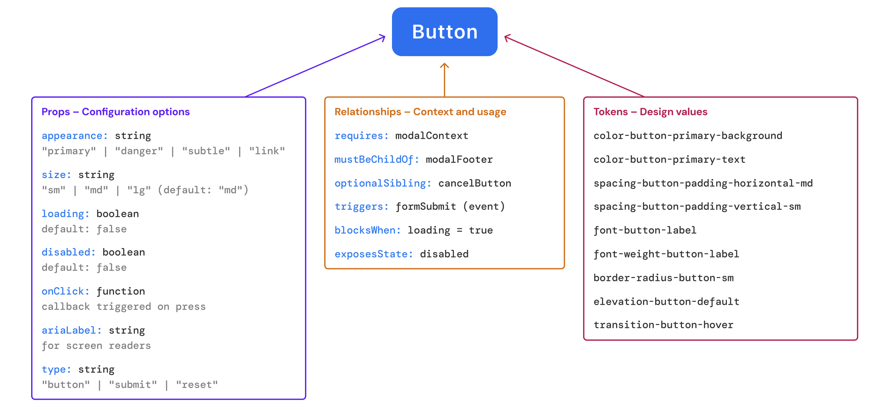
These agents operate with minimal human intervention to complete complex, dynamic processes – they need structured and predictable interfaces to work effectively. If you want your design system to survive this shift, you need to start treating your component architecture like an API – clear contracts, explicit inputs and outputs, and semantics that work for humans and machines alike.
🔑 Key insight: Your design system is already an API; the question is whether it's a good one.
Rethinking components through an API lens
At its core, an API defines how systems communicate. It sets clear expectations: inputs, outputs, and rules. Great APIs are consistent, self-documenting, and predictable. They're composable, extensible, and delightfully boring in all the right ways.
Whether you're a design systems lead, design technologist, or PM working on AI products – examining your component library through this lens reveals gaps:
- Does it offer clear contracts for usage?
- Are inputs and outputs explicit and well-documented?
- Do you have reusable patterns with consistent naming?
- Are there minimal surprises across implementations?
If not, it might be time to shift gears.
Developers browse Storybook, agents scrape your tokens, plugins assemble interfaces from your library. In all cases, your system is being consumed programmatically – just like an API.
What agents actually need: structure over style
Agents don't interpret vibes. They parse structure.
Consider this scenario: an AI design assistant needs to build a product onboarding flow. The component library they’re referencing utilises components with names like ‘InfoBanner’, ‘CardBase’, and ‘BoxAlt’.
The assistant has no clue what any of these actually do. The names might hint at visual styling, but they don’t encode purpose or behaviour – which one guides users? Which highlights features? Which prompts actions?
Systems with purpose-driven naming – ‘FeatureHighlight’, ‘OnboardingStep’, ‘PrimaryActionButton’ – give agents actual context. This approach to naming, combined with semantic properties (ex. appearance="danger" or type="submit") and structured relationships (ex. mustBeChildOf: OnboardingContainer) enables agents to compose interfaces that actually work.
This isn't just a naming issue – it's about treating your component library like an API. One with explicit contracts, not guesswork. One where even non-human consumers can make sense of your design system without relying on undocumented conventions or visual inference.
So what does an API-first approach actually involve?
- Explicit taxonomy: Shift from appearance-based naming to purpose-driven classification. Components should communicate their role in the interface, not just their visual treatment. Whether through naming conventions, variant systems, or structured props – the key is encoding intent in your component's API, not just its name.
- Props as API parameters: Treat component props like method parameters with clear contracts. Every prop should have documented types, defaults, and constraints that communicate intent. The goal is making props semantically meaningful, so an agent understands that appearance=”danger” signals a high-stakes action, not just visual styling.
- Tokens as system constants: Think of tokens like system constants. Style Dictionary – Amazon's open-source tool – lets teams define styles once and reuse them across platforms. When tokens are named semantically (ex. ‘color-border-critical’ rather than ‘cherry-500’), agents can understand intent and apply them contextually.
- Composable contracts: Design components that describe their relationships. A modal that requires ‘ModalHeader’, ‘ModalBody’, and ‘ModalActions’ creates a clear contract – just like a RESTful API with required parameters.
The shift? From implicit knowledge to explicit contracts.
Let’s compare how a single onboarding step might be implemented in a traditional design system, versus one built for agent readability.
Traditional (human-facing) system
In a traditional design system, naming conventions often focus on how things look rather than what they do. The examples below show component names that describe appearance – not purpose. That works fine for humans, who can infer context visually or through familiarity. But for agents, these names are often meaningless. There's no contract, no behavioural signal – just surface-level styling.
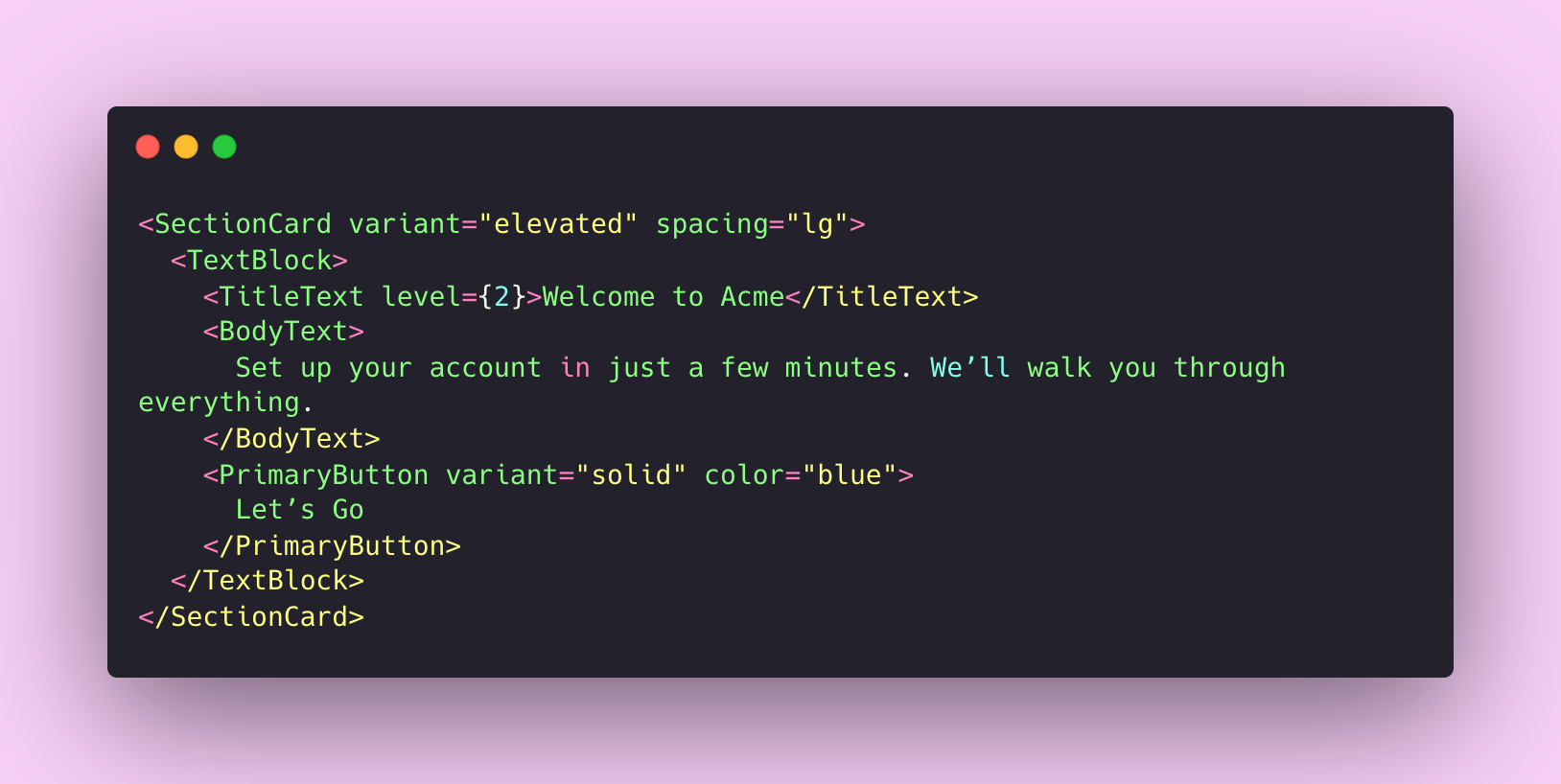
Why doesn’t this work for agents?
- Visual-first component names: SectionCard, TextBlock, and PrimaryButton describe layout and visual style, but give no clues about functional purpose (ex. is this related to onboarding? A form? A prompt?)
- Semantic signals missing: Props like variant="solid" and color="blue" control visual treatment, but offer no indication of behavioural context. An agent can't tell whether this is a primary call-to-action, a cancel button, or a navigation trigger
- No compositional contracts: There's no parent component to define where this UI belongs in the product flow or how it connects to other steps
- Relies on human intuition: A designer might understand that this is part of an onboarding flow from the copy and the layout, but an agent only sees styled containers and generic components with no semantic cues.
Agent-ready system
An agent-ready system treats components like API endpoints, with clear inputs, explicit semantics, and documented relationships. These systems don't rely on guesswork – they expose purpose through props, reinforce meaning with tokens, and document dependencies as part of the interface contract. Here's an example of what that might look like:
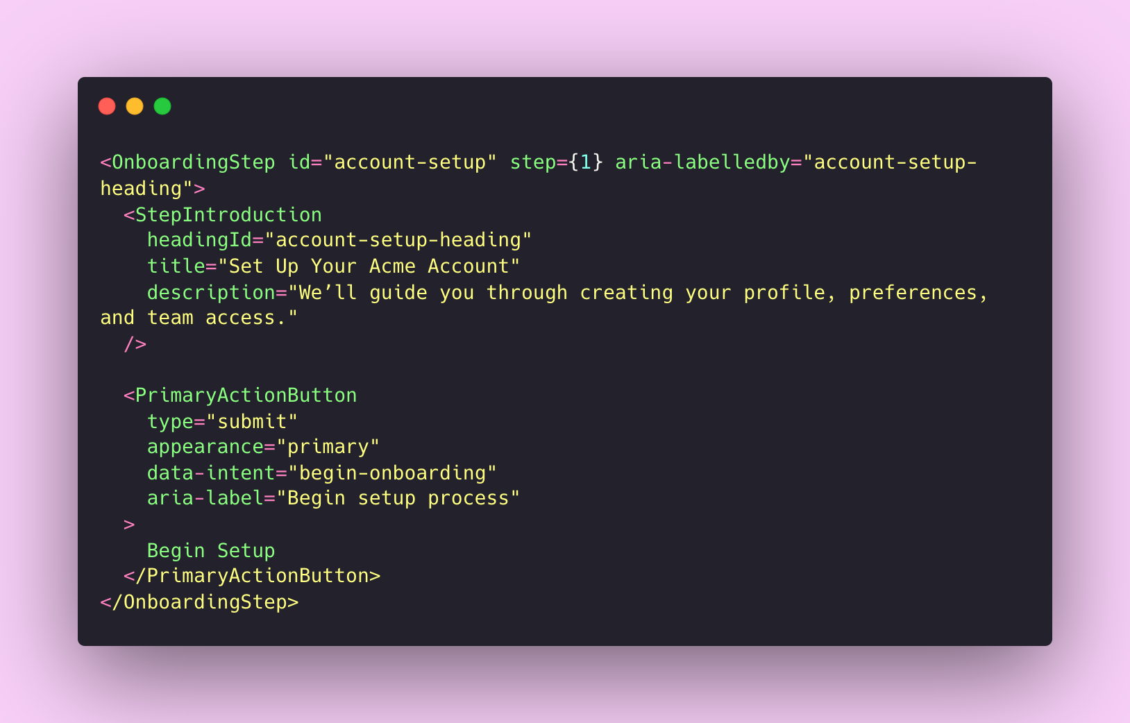
What makes this agent-ready?
- Purpose-driven component names: OnboardingStep, StepIntroduction, PrimaryActionButton tell you what each element does, not just how it looks
- Explicit semantic props: type="submit" and data-intent="begin-onboarding" give agents clear hooks for decision-making
- Structured relationships: Nesting PrimaryActionButton inside OnboardingStep creates a clear contract – just like an API endpoint with required parameters
- Machine-readable identifiers: id="account-setup" and step={1} let agents work out flow order and dependencies
This represents a fundamental shift in how we think about design. We're not just styling screens anymore – we're encoding intent that agents can interpret and act on. What used to be visual choices or UX patterns are now expressed as API contracts. And increasingly, those decisions aren't being made by people – they're being executed by systems.
Moving from implicit, human-readable conventions to explicit, machine-readable contracts does more than prepare us for agentic workflows. It improves clarity, reduces redundancy, and helps every consumer of the system (human or not) make better decisions, faster. Structure scales. Vibes don't.
Tools are evolving fast. But tools alone don't make systems agent-ready – structure does. The real question: is your design system ready for what's already happening?

Is your design system ready for AI? AI agents are already consuming design systems. Find out if yours is structured to be understood by them.
Your tools are evolving – has your system kept up?
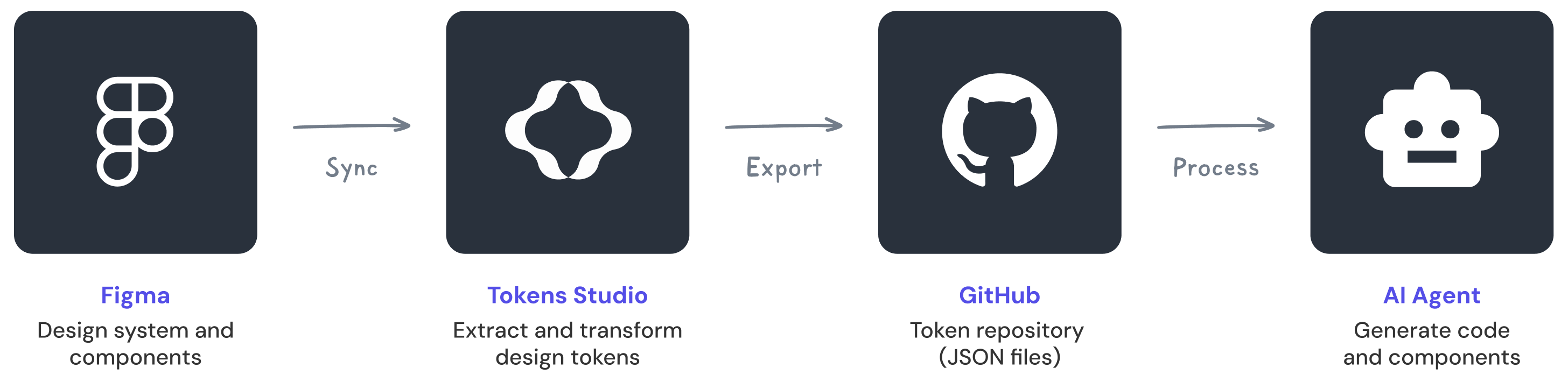
Figma's AI features are currently in open beta, already learning from real-world component structures. Plugins like Visual Copilot are bridging the gap between design and code by understanding component structures and design tokens.
Tools like Tokens Studio allow design tokens to be stored in JSON and synced with repositories like GitHub, creating machine-readable design systems that agents can consume. Style Dictionary processes these JSON files and transforms them into platform-specific code – patterns that AI agents can learn and replicate.
The infrastructure is there. The question is whether your design system is structured to take advantage of it.
Structure is strategy
This shift toward agent-readable systems isn't just about preparing for the future – it's a forcing function that improves your design system today.
When you design components with API principles in mind, you naturally:
- Reduce duplication: When contracts are explicit, redundant solutions become obvious
- Improve onboarding: New team members can understand component behaviour without relying on undocumented conventions
- Enable automation: Whether it's code generation, automated testing, or consistency checks, structured systems are easier to analyze and manipulate programmatically
- Future-proof your investment: As design tools become more intelligent, your system becomes more valuable rather than obsolete
It makes you a better systems designer – you start thinking in terms of intent and contracts, rather than just visual output.
Ready to act? Here's how you can start making your system agent-ready today.
Turning strategy into action
Structured, semantic components sound great in theory. But how do you actually build them? The good news: you don't need to scrap everything and start over. You just need to be more intentional about how you design components. Here's the practical bit.
- Audit your component names: Ask yourself – would this name make sense to someone who's never seen your system before? Does it communicate purpose without relying on visual cues or team knowledge?
- Document props like API endpoints: Use clear types, provide sensible defaults, and explain the impact of each option. Tools like Storybook can help document components in isolation, ensuring accessibility is considered for every state.
- Map component relationships: Document which components compose others. Define dependencies and nesting rules explicitly.
- Embrace semantic tokens: The Design Tokens Community Group has established standards for token formats that are machine-readable. Adopt naming conventions that describe purpose and context, not just visual appearance.
- Refactor with intent: Remove components that exist purely for stylistic variation. Consolidate redundant variants. If a component doesn't solve a unique, reusable problem, does it really belong?
- Expose your system via structured data: Make your design tokens and component metadata available as structured data that tools can actually read, such as JSON, YAML or other formats agents can parse.
💡 Start small: Pick one component and make it agent-ready. The process will teach you everything you need to scale.
Looking ahead: the multi-agent future
The trajectory is obvious: agentic AI systems can now set goals, plan multi-step tasks, and execute complex actions without much human oversight. We're seeing early signs of multi-agent orchestration – where multiple AI agents can work together, divide tasks, handle handoffs, and run workflows independently. No humans required.

In the next 12-24 months, it’s likely that every major product team will have at least one internal AI agent (if they haven’t already). The teams getting their systems ready now – with clear semantic structure, explicit contracts, and machine-readable documentation – will be miles ahead.
With that in mind, it’s worth noting that agents aren’t perfect. They still mess up nuance and misread edge-cases. But they’re getting better, fast. Teams that ignore this will up dealing with chaos: agents making wrong assumptions, creating inconsistent interfaces, or completely missing the intricacies of how components should work.
The teams doing this groundwork now will set the standards that everyone else follows later. And at the core of that groundwork? Clear, intentional semantics.
At its heart, this is about moving from implicit to explicit knowledge.
Human designers can intuit that a button with rounded corners and a blue background is probably a primary action. Agents can’t make those leaps – they need us to spell out our intentions. They don’t intuit behaviour – they infer it from structure. That makes your naming, composition, and documentation not just helpful, but essential infrastructure for intelligent tools.
That doesn’t mean dumbing down your system – it means designing with more clarity and intent. When we name a component ‘FeatureHighlight’ instead of ‘BlueCard’, we're not just helping agents – we're creating clearer mental models for human team members too.
The future of design systems isn't about building for humans or machines – it's about building systems that serve both effectively. Treat your components like an API, and you'll create infrastructure that's more robust, more scalable, and more ready for whatever comes next.
Your next collaborator might not be human. But they'll still need a good system to do meaningful work.
Thanks for reading! This article is also available on Medium, where I share more posts like this. If you're active there, feel free to follow me for updates.
I'd love to stay connected – join the conversation on X, Bluesky, or connect with me on LinkedIn to talk design, digital products, and everything in between.


Member discussion