


I've spent the last decade building and maintaining design systems across various organisations, and one pattern consistently emerges: certain components become beloved workhorses, while others – often crafted with equal care – gather digital dust in the repository. This disparity isn't random or technical; it reflects deeper psychological and organisational dynamics that influence how design systems function in practice.
This uneven adoption used to frustrate me. Why would teams bypass perfectly good components in favour of custom solutions? The answer, I've discovered, lies not in the quality of code or design, but in understanding how humans make decisions within organisational contexts. Let's dig into what makes the difference between a component everyone reaches for and one that languishes unused.

The adoption gap: A universal challenge
Every design system team I've spoken with faces this challenge. Industry surveys consistently show that in most organisations, roughly 60% of design system components see regular usage, while the remaining 40% experience minimal adoption. This "adoption gap" remains persistent regardless of team size, industry, or design system maturity.
Even established systems like Shopify's Polaris or Atlassian's Design System face this reality. At a recent design systems meetup, I heard similar stories from several enterprise teams who discovered their meticulously crafted components weren't being adopted because teams had already solved those problems in ways that better fit their specific needs.
This isn't a failure of craftsmanship – it's a mismatch between central system thinking and on-the-ground team realities.
What actually drives component adoption?
Through both research and hard-won experience, I've identified several factors that separate widely-adopted components from those that languish:
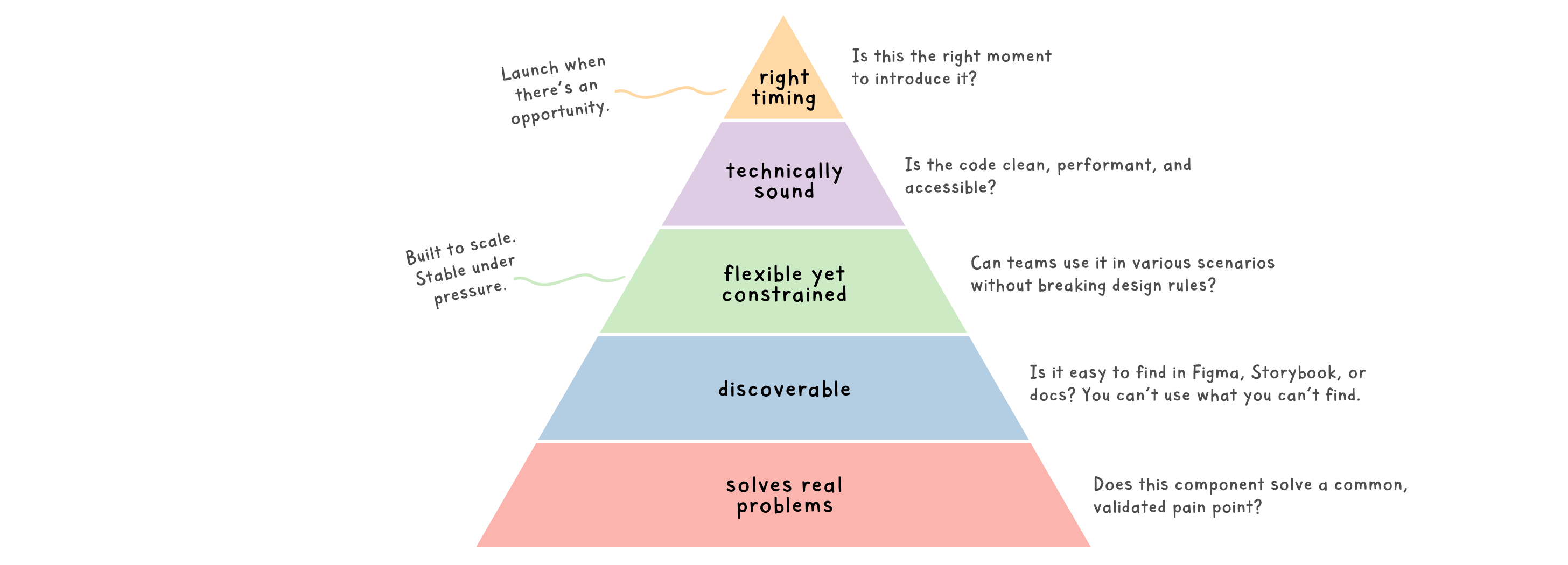
1. Solving real, frequent problems
Components that address common, recurring design challenges naturally see higher adoption. The more frequently a problem occurs across products, the more likely its solution will be embraced.
I witnessed this first-hand when building a component library for a fintech company. Our form components saw immediate adoption across 6+ product teams, while our elaborate card sorting interface – despite being technically impressive – was implemented by only two teams who actually needed that specific interaction.
💡 Practical tip: Before building a component, gather tangible examples of the problem it solves across your product(s). I like to create a simple "problem frequency" score by counting how many teams or features would benefit from the solution.
2. The effort-value equation
Teams instinctively calculate whether using a design system component saves more effort than creating a custom solution. This calculation includes not just implementation time, but learning curves, customisation needs, and potential technical debt.
What I've found most interesting is how often this calculation is based on perception rather than reality. Teams regularly overestimate the work required to implement a system component if their first experience was challenging.
💡 Practical tip: Make the first 15 minutes of implementation incredibly smooth. Create copy-paste examples that work immediately, then allow for progressive customisation. First impressions dramatically influence adoption.
I call this the "First 15" principle, and it's transformed how I like to introduce components. Here's what works:
- Implementation snippets: Provide complete, self-contained code snippets that teams can copy directly into their projects without modifications. For React components, include all necessary imports and props.
- Quick-start guides: Create 5-minute tutorials with videos or screenshots showing exactly how to implement the component from start to finish. Keep these concise – overwhelming documentation is as bad as none.
- Interactive examples: Provide playground environments where developers can experiment with the component before adding it to their codebase. Whether you use Storybook, Codesandbox, Stackblitz, or your own custom solution, the key is allowing real-time manipulation of props and states without requiring local setup. Historically, I’ve found that embedding Storybook instances directly in documentation has dramatically increased developer engagement.
- Default states that work: Ensure the most basic implementation works well without customisation. A button should look good and function correctly with just
<Button>Submit</Button>, even if it has dozens of optional props.
When we redesigned our component documentation to follow these principles, we saw a 58% increase in adoption of new components within their first month. The lesson? Lower the activation energy required to use your components, and teams will be far more likely to give them a chance.
3. Discoverability trumps perfection
I've seen brilliant components fail simply because teams couldn't find them when needed. The most successful design systems I've worked with aren't necessarily the most comprehensive – they're the most navigable.
I'm a firm believer in maintaining consistent naming between design and code – this parity is essential for clear cross-functional communication. But when it comes to documentation, information architecture, and navigation, I've learned to be more flexible in my approach.
At one organisation, we faced persistent feedback that teams couldn't locate components they needed. While preserving our technical naming convention ("ProgressIndicator", "StatusBadge", "AlertBanner"), we added a parallel task-based navigation layer that mapped to how teams actually framed their needs – by the problems they were solving ("Showing loading states", "Indicating status", "Communicating errors").
This dual structure meant that whether someone approached our system thinking "I need a status badge" or "I need to show approval status", they'd end up at the same component. The result? Component usage increased by 40% in the following quarter as teams with different mental models could all find what they needed without having to translate their thinking into system terminology first.
💡 Practical Tip: Organise your documentation around both component names (for those who know what they want) and user tasks/problems (for those who know what they need to solve). Conduct search log analysis or user interviews to identify the actual terminology your teams use when looking for solutions.
4. The goldilocks zone: Flexibility vs constraint
Components need to hit a sweet spot between flexibility and constraint. Too rigid, and teams will reject them for edge cases. Too configurable, and they become unwieldy and hard to implement.

I've found the most successful components follow an "80/20" principle – they handle the most common use cases elegantly out of the box, while providing clear extension points for the remaining edge cases.
💡 Practical tip: When building complex components, identify the non-negotiable brand elements that must remain consistent, then create explicit customisation options for everything else. Document where customisation is encouraged versus where it might break accessibility or brand cohesion.
5. Technical feasibility as a design constraint
No matter how beautifully designed a component might be, if it doesn't perform well technically, it simply won't be adopted. But this isn't a failure of engineering to implement design; it's a failure to recognise that technical considerations are design considerations.
In teams where I've seen the highest component adoption rates, engineers don't just implement designs – they actively shape them. This "engineering-informed design" approach completely transformed how I work. Rather than designers creating specifications in isolation that engineers then struggle to build efficiently, technical constraints become creative parameters from the start.
In my current practice, we flip the traditional model: technical assessment happens before visual design is finalised, not after. When engineers highlight potential performance or implementation challenges, we treat these not as roadblocks but as design parameters that spark better solutions. Collaboration is key.
💡 Practical tip: Include engineers in component discovery and definition phases, not just implementation. Lean on their expertise around browser or platform-specific quirks, performance, accessibility, etc. Use those insights to inform your design decisions, before getting attached to a specific solution.
6. Timing and organisational context
Components released just when teams need them see dramatically higher adoption than those introduced during quiet periods. This sounds obvious, but is frequently overlooked in roadmap planning.
I've had success synchronising component releases with major product initiatives – when a client was pushing for improved error handling, the design system team were able to align our new form validation components with the same release. Adoption happened naturally, without the need for extra advocacy work.
💡 Practical tip: Map your component roadmap against known product initiatives and releases. Prioritise components that align with current organisational priorities and upcoming feature work.
The psychology behind resistance
Understanding the psychological factors behind resistance has been crucial in my work:
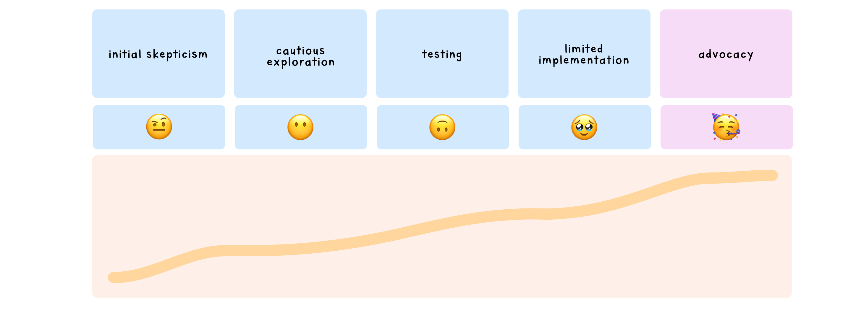
Status-quo bias
Teams develop comfort with existing patterns. I've watched designers acknowledge a system component is better, yet continue with their existing solution simply because it's familiar.
And that's okay. It's on us as design system maintainers to instill confidence and comfort in the changes we propose. Rather than viewing this resistance as stubbornness, see it as a natural human response to change – one that requires patience and support to overcome. The responsibility for adoption doesn't rest with the teams using the system; it rests with those building and advocating for it.
Ownership and autonomy
Product teams often feel stronger ownership over solutions they've created themselves. This isn't about ego – it's about having autonomy and control over their user experience. Having empathy is crucial here; these teams are proud of what they've built, and they understand their specific users in ways that central design system teams sometimes can't.
I've found that openly acknowledging this dynamic can defuse resistance – rather than positioning the design system as the "correct way", frame components as tools that free teams to focus on unique challenges that actually differentiate their product.
💡 Practical tip: Establish clear contribution models that invite teams to shape the system. Implement a "contributors as authors" approach by prominently crediting individuals who contribute components or improvements in your documentation. This simple acknowledgment transforms the relationship from "us vs. them" to "we built this together". I've seen reluctant teams become enthusiastic advocates after seeing their names credited for their contributions, validating both their expertise and their understanding of specific user needs.
Trust and track record
One problematic component can damage trust in the entire system. Early failures create skepticism that takes significant effort to overcome.
This trust dynamic plays out in organisations regularly. When teams encounter issues with components – like a date picker with accessibility problems, or a dropdown with performance issues – the impact extends far beyond that single component. Even after fixing the specific problems, teams often remain hesitant to adopt new components for months afterwards, having lost confidence in the system as a whole.
💡 Practical tip: Build trust through reliability. Release fewer, well-tested components rather than a wide array of inconsistently implemented ones. Quality over quantity builds lasting confidence.
Strategies that actually work
Over years of trial and error, I’ve found these approaches invaluable in improving component adoption, across a variety of different teams:
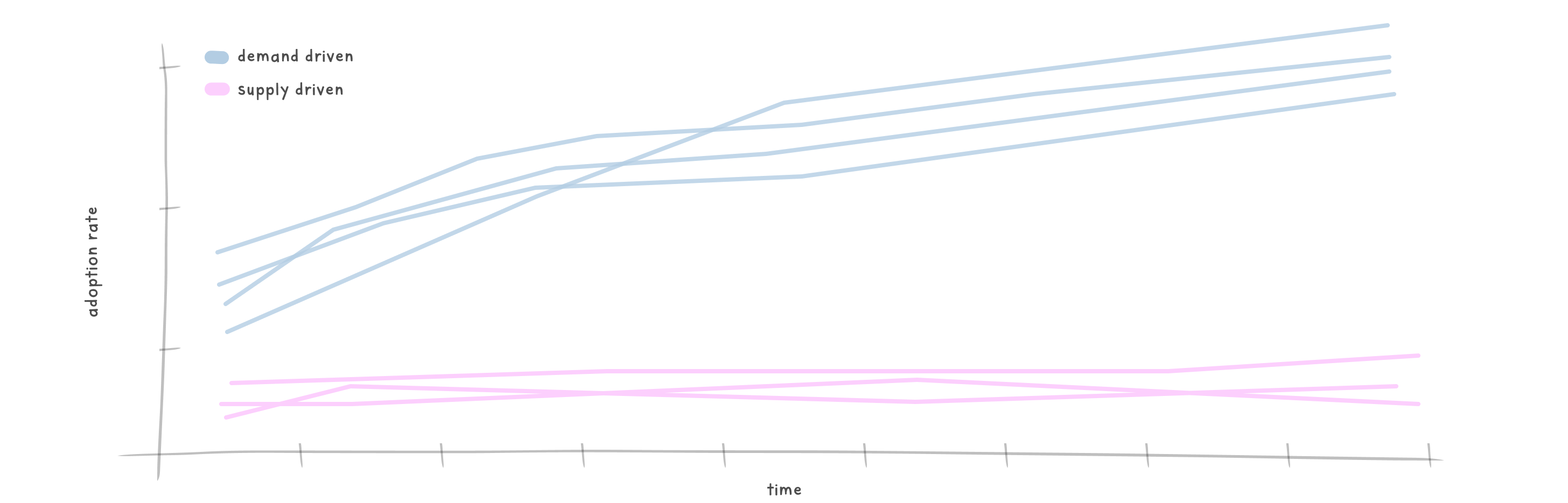
1. Start with demand, not supply
Rather than building components based on theoretical completeness, prioritise based on actual team needs. This seems straightforward, but it's surprising how many design systems are built on assumptions rather than demonstrated demand.
When coaching teams to shift to a request-based model – building components only when multiple teams expressed need – our average adoption rate jumped from 35% to over 70%.
Dan Mall, one of the industry's most respected design system experts, offers a beautifully simple guideline here that I've found invaluable: "Three times is a pattern". As Mall explains, "If one team needs a component, wait before adding it to the system. Twice even... sit tight. But if three or more teams need a component right now, or very soon, that's a good candidate to contribute into a design system".
This rule of thumb has saved me countless hours of debate in prioritisation meetings. I remember a particular instance last year when we were debating whether to add a specialised data filter component to our system. One team had implemented it for their analytics dashboard, and another had created something similar for search results. The component seemed useful, but was it worth the investment?
Rather than proceeding immediately, we documented these two instances and waited. Within six weeks, a third team approached us needing the same functionality for their reporting feature. Following Mall's rule, we prioritised building it into the system. Not only did all three teams adopt it immediately, but within three months, two additional teams had implemented it as well – validation that waiting for that crucial "third time" had helped us identify a genuinely common need, rather than an edge case.
💡 Practical tip: Create a simple component request process that requires evidence of the problem across multiple teams. This ensures you're solving real rather than hypothetical issues. Research shows that design systems with formal request processes consistently see higher component utilisation compared to those without structured intake mechanisms.
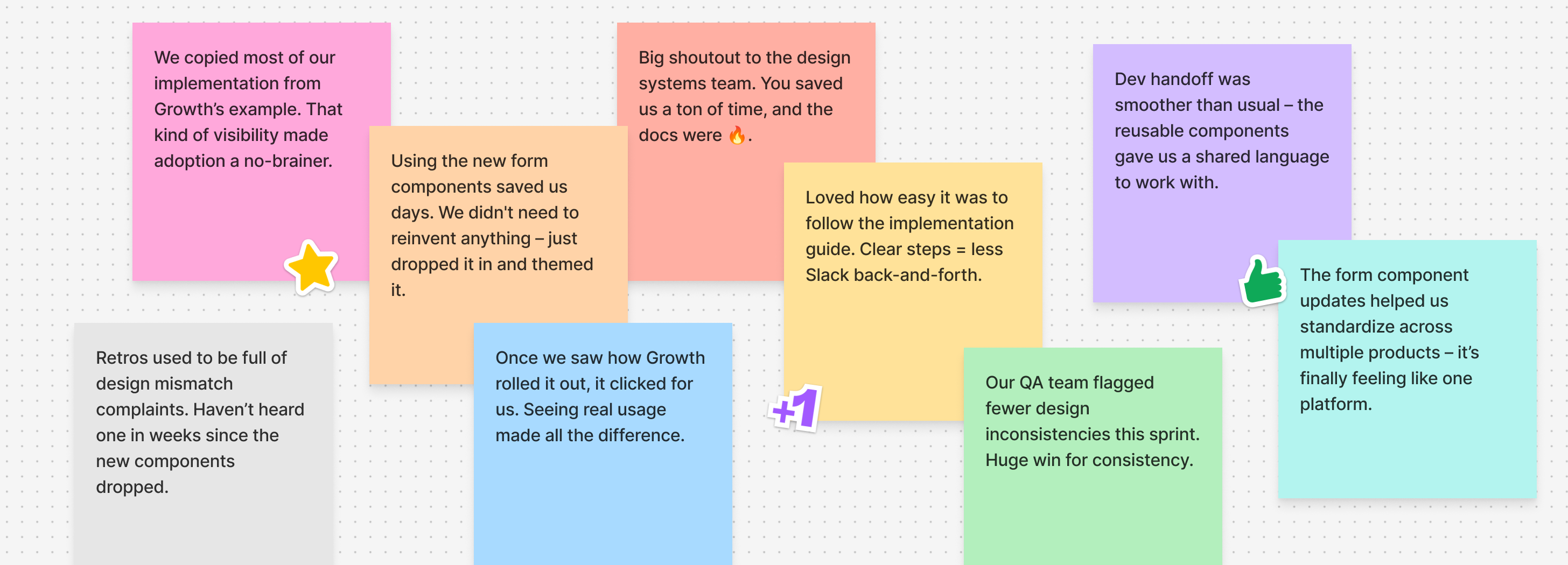
2. Co-creation beats handoffs
Some of my most successful components were co-created with the teams who would use them. This isn't just about buy-in – it's about incorporating the nuanced understanding that product teams have about their specific constraints.
When building a complex filtering component for a data-heavy application, we embedded a design system designer directly with the product team for two weeks. The resulting component incorporated edge cases we would have missed, and the product team became advocates for its adoption elsewhere.
💡 Practical tip: Create component working groups that include representatives from different product teams. Give them actual decision-making power, not just consultation roles.
3. Measure what matters
The metrics you choose shape behaviour. If you measure success by the number of components created, you'll get quantity over quality. If you measure adoption rates, you'll focus on what teams actually need.
I've found investment in usage analytics pays enormous dividends. Being able to show that a component is used in 75% of product features carries more weight in prioritisation discussions than subjective arguments.
Recent industry surveys indicate that organisations with successful design systems are increasingly tracking component adoption metrics. The shift toward data-driven governance is one of the most significant trends in design system evolution.
💡 Practical tip: Implement basic tracking for component usage across your products. Even simple metrics like "number of implementations" provides valuable data for prioritisation and improvement.
4. Create migration paths, not mandates
Rarely can teams adopt new components immediately. Acknowledging this reality and providing incremental migration paths dramatically increases adoption over time.
One effective approach I've used is "component pairing" – temporarily supporting both old and new implementations with documentation on migration. This removes the all-or-nothing pressure that often leads to rejection.
💡 Practical tip: For major components, create explicit migration guides that acknowledge the reality of existing implementations. Outline steps for incremental adoption rather than requiring complete rewrites.
5. Show, don't tell
Nothing drives adoption like seeing peers successfully implement a component. Rather than abstract promotion, showcase real implementations by respected teams.
Internal case studies demonstrating time saved, improved consistency, and user benefits speak volumes. When we highlighted how one team reduced implementation time by 70% using our new form components, three other teams requested implementation support within a week.
The hidden skill: Design system leaders as people managers
Understanding component adoption isn't just about the what; it's equally about the who. After years in this space, I've realised a truth that's rarely discussed: design system leadership is fundamentally a people management role disguised as a technical one.
Design systems aren't just a collection of components and guidelines – they're a vehicle for organisational change. This perspective shifts our understanding of what makes a successful design system leader.
When components aren't being adopted, the instinct is often to blame the component itself – its design, implementation, or documentation. But frequently, the real issue lies in organisational dynamics: team incentives, communication patterns, or even interpersonal relationships.
The most effective design system leads I've worked with excel at:
Empathetic facilitation
They create spaces where different perspectives can be heard, particularly when tension exists between centralised consistency and team autonomy. They position themselves as "helpers, not gatekeepers", facilitating conversations rather than dictating solutions.
Strategic influence
They understand the art of influence without authority. Most design system teams don't have direct control over product teams, so they must become skilled at building alliances, demonstrating value, and creating champions across the organisation.
Expectation management
They set realistic expectations about what the system can (and cannot) solve. A design system isn't magic – it won't fix a broken process or dysfunctional team. Managing these expectations prevents disappointment and builds trust.
Conflict resolution
They navigate the inevitable tensions between centralisation and autonomy, consistency and flexibility, speed and quality. When teams push back on a component, these leaders dig deeper to understand the underlying reasons, addressing concerns rather than enforcing compliance.
My most successful component launches weren't when I perfected the technical implementation, but when I invested time in building relationships with the teams who would use them. Understanding their workflows, acknowledging their constraints, and involving them in decisions created the psychological safety needed for meaningful adoption.
The success of a design system has less to do with the components themselves and more to do with how well you've helped people understand why the system matters to them personally.
Design system teams often focus on improving their technical skills or design acumen, but I'd argue that developing people management abilities – empathy, diplomacy, and communication – yields greater returns for component adoption than any technical optimization.
💡 Practical tip: Plan component launches like change management. Treat each significant component launch as a change management exercise. Map out stakeholders, anticipate concerns, and create a communication plan. The goal isn't just to announce a new component but to guide teams through the emotional journey of adopting it.

Finding the right balance
The most successful design systems find the right balance between standardisation and team autonomy. Rather than forcing adoption, they create components compelling enough that teams choose to use them.
The goal isn't to create components teams must use, but components teams want to use because they solve real problems better than alternatives.
This philosophy is gaining traction. Industry research consistently shows that design systems embracing distributed ownership models with centralised guidance achieve higher component adoption rates than strictly centralised systems. The era of top-down design systems is giving way to federated models that balance consistency with team autonomy.
Component adoption ultimately boils down to empathy – understanding the real needs, workflows, and constraints of the people using your design system. By shifting focus from building comprehensive libraries to solving genuine problems in accessible ways, you can create components that naturally find their place in product development.
The most effective design systems don't measure success by the number of components created, but by the percentage meaningfully adopted. Focus on value over volume, and you'll build systems that truly serve your organisation's needs.
When planning your next component, ask not just what you can build, but what teams will actually embrace. The most elegant solution is worthless if it sits unused in your design system.
Thanks for reading! This article is also available on Medium, where I share more posts like this. If you’re active there, feel free to follow me for updates.
I’d love to stay connected – join the conversation on X, or connect with me on LinkedIn to talk design, digital products, and everything in between.


Member discussion