


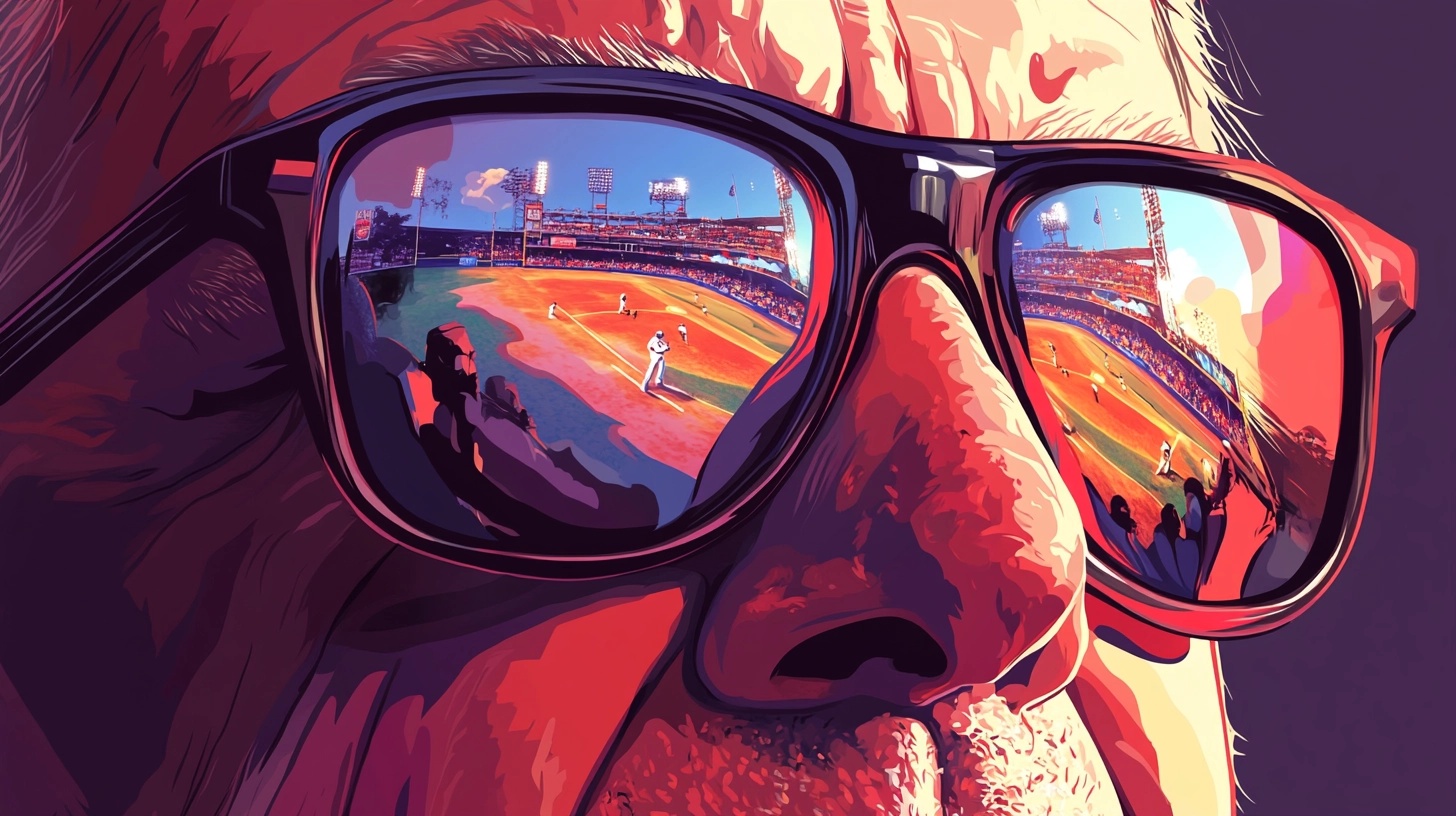
I've always found it fascinating how two seemingly unrelated worlds – baseball and design – share this interesting parallel. Both have transformed from gut-feeling industries to data-informed practices, and the lessons from one can powerfully inform the other.
Twenty years ago, Michael Lewis published "Moneyball", telling the story of how the Oakland Athletics used data analytics to compete against teams with three times their payroll. This approach – later dubbed "sabermetrics" – fundamentally changed how baseball organisations evaluate talent and build winning teams.
I first read Moneyball years before I ever considered a career in product design. I was amazed by how the Oakland A's challenged conventional wisdom with data, finding value where others saw none. When I later entered the design field, the parallels began to emerge in surprising ways.
In meeting after meeting, I saw the same reliance on conventional wisdom that baseball had clung to for decades – "users won't scroll", "three clicks maximum", "above the fold is all that matters". It reminded me exactly of baseball's old guard insisting that a player "looked like a ballplayer" or had "the right build."
The more I worked in design, the more I found myself thinking about Billy Beane and the A's front office. They weren't just using data – they were asking entirely different questions than everyone else. And that's precisely what great design needs too.
From gut feeling to evidence
The gut feeling era
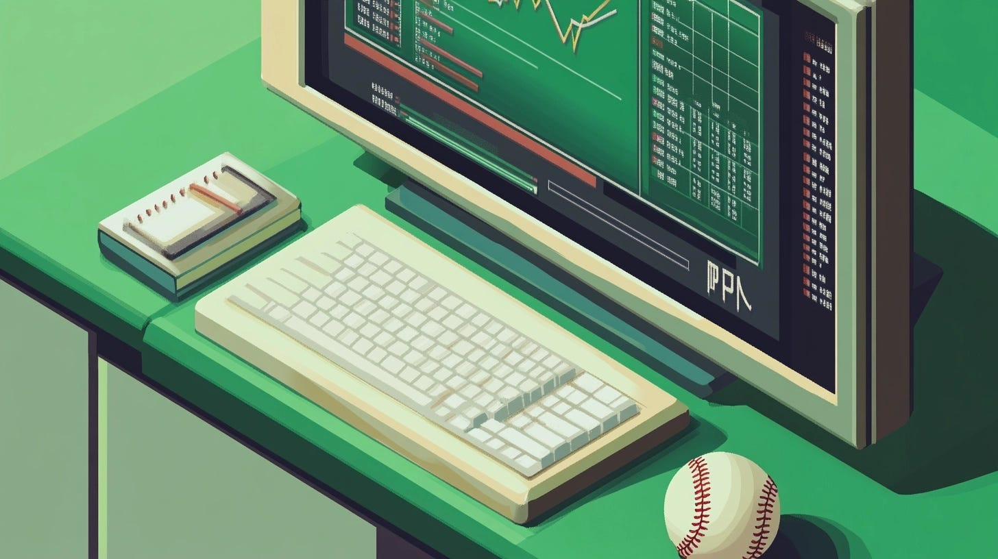
For over a century, baseball decisions were made through scouts evaluating players based on what they saw, as well as traditional stats that measured obvious outputs. Add in decades of "baseball wisdom" and gut feelings from managers, and you had a system that favoured obvious talents and conventional thinking. If a player didn't look the part or fit the mould, they were dismissed as "flawed" talents.
Scouts would travel the country looking for players who "looked like ballplayers" – a 6’2 shortstop with perfect mechanics and an athletic build. They'd dismiss players who didn't fit the mould, even if their performance suggested otherwise. Statistics were limited to basic counts: batting average (AVG), home runs (HR), and runs batted in (RBIs) for hitters; wins (W) and earned run average (ERA) for pitchers. These numbers told part of the story, but not the whole story. Teams still relied too heavily on lived experience and intuition.
The data revolution
In 2002, The Oakland A's – led by GM Billy Beane – took a radical approach. They started asking entirely different questions than everyone else. While other teams were asking "does this guy look like he can play?" the A's asked "what actions on the field actually lead to scoring more runs?".
This shift changed how they thought about everything. They discovered that on-base percentage – how often a player reached base by any means – was hugely undervalued, despite being one of the strongest predictors of offensive success. Other teams were paying premiums for players with high batting averages, while undervaluing the ability to draw walks – even though getting on base consistently was more valuable than just getting hits. The A's found value in these overlooked stats, giving them a massive competitive advantage.
Billy Beane captured this perfectly when he said "your gut makes mistakes. Your gut has bias". And honestly, this principle applies perfectly to design too.
From aesthetics to evidence
Not long ago, design decisions often followed a familiar path:
- Teams relied heavily on designer intuition and aesthetic preferences
- Decisions were made by whoever had the most seniority
- The focus was on what looked good rather than what worked well
- There was limited measurement of actual user outcomes
This approach made sense when websites were primarily digital brochures. But as websites and digital products became more complex, this gap between beautiful designs and business impact created conditions for UX design roles to explode in popularity.
Companies suddenly realised they needed professionals who could bridge aesthetics with functionality. According to the U.S. Bureau of Labor Statistics, employment for UI/UX designers grew by 26% between 2010 and 2020 in the U.S. alone. What had once been the domain of graphic designers became a specialised discipline.
This shift reflects a broader trend that emerged: good design began moving beyond aesthetics and gut feelings to focus more on evidence-based approaches. The most successful design teams today combine aesthetic sensibility with rigorous user research, much like how modern baseball teams blend traditional scouting with statistical analysis.
Design principles from the diamond
I've spotted several patterns from baseball's analytics revolution that directly apply to how we design products today.

Find your hidden metrics
The Oakland A's realised on-base percentage was hugely undervalued despite being far more predictive of winning than flashy stats like home runs. Other teams overlooked players who drew walks because walks don't make highlight reels.
In design, we have our own undervalued metrics. While stakeholders obsess over vanity metrics or aesthetic appeal, the numbers that actually predict success often get ignored.
Task completion rate isn't as sexy as time-on-site, but it directly measures whether your product helps users get the job done. Support ticket volume after a design change? That's your real usability metric. In digital banking, everyone wants to track login frequency, but what really predicts customer lifetime value? Successful transaction completion and smooth error recovery.
What I've learned: Apply the 80/20 principle to your metrics. Pick 2-3 metrics that directly measure user success for your current project. For e-commerce, abandonment recovery rates might matter more than browse-to-purchase ratios.
Challenge the conventional wisdom
Baseball was drowning in unwritten rules. "Don’t steal third with a runner on second". "You need a proven closer". The analytics revolution forced teams to test these assumptions, and most didn't hold up.
Our field has its own collection of rules that we rarely question – "users won't complete forms with more than five fields", "mobile users never tap the hamburger menu", "users always abandon if they have to create an account", "bright colours are always better for CTAs". We treat these as universal truths without testing whether they apply to our specific users and contexts.
This goes against hypothesis-driven design. I've watched teams religiously split forms across multiple screens because they believed users couldn't handle complexity. But user testing often showed the opposite – progressive disclosure actually reduced cognitive load.
These "rules" almost always have exceptions, especially when users are motivated to complete a task. Context matters enormously.
💭 Try this: Pick one "UX law" your team treats as immutable truth. Frame it as a hypothesis and run an A/B test. What's the smallest experiment you can run to validate or invalidate this belief?
Look ahead, not just back
Modern baseball teams don't just describe what happened – they predict what will happen. They model how a college player's stats might translate to the majors, or how ageing impacts different skills.
Most design teams excel at descriptive analytics – "here's what happened after launch". But the real power comes from predicting what will drive long-term success.
This is about leading vs. lagging indicators. Onboarding completion rates look great on dashboards, but what actually predicts retention? Often it's users who show high activation – customising settings, completing key tasks, reaching their first "aha moment". The ones who rush through onboarding? They're gone within weeks.
💭 Try this: Identify one early user behaviour that might predict long-term success. Start tracking how initial interactions correlate with outcomes weeks or months later.
Spot market inefficiencies
The A's succeeded by finding undervalued player attributes. While other teams fought over established stars, they quietly built rosters of players who excelled in overlooked areas.
Where are your competitors focusing? Those blind spots represent opportunities for design differentiation.
In digital products, accessibility often represents a similar inefficiency. While everyone chases flashy animations, companies that invest deeply in accessibility see unexpected benefits: better SEO, broader market reach, and users who become fiercely loyal because they can actually get their job done.
Instead of competing head-to-head on obvious features, find the areas competitors neglect. Notion didn't win by making the best word processor – they won by solving the integration problem between note-taking, project management, and documentation.
💭 Try this: Audit your top 3-4 competitors. What are they all optimising for? Look for neglected user needs that could become your competitive advantage.
Never stop iterating
One of baseball's biggest lessons? You can't stick with the same strategy forever – what worked for the Red Sox when they won the World Series in 2004 wasn't enough when they won again in 2007, 2013, and 2018. Each championship team was built differently because the game had evolved, and other teams had caught up with their analytics approach.
"We've solved this problem" might be the most dangerous phrase in product design. User behaviours evolve, technology changes, competitive landscapes shift.
Design systems need similar evolution. First versions are hypotheses, not final solutions. The teams that embrace uncertainty and build rapid feedback loops outperform those who treat launches as finish lines.
💭 Try this: Schedule monthly "design archaeology" sessions. What assumptions didn't hold up? What would you design differently now? Treat your design decisions like experiments.
Overcoming data resistance
The baseball analytics revolution faced fierce resistance. Scouts who'd spent decades evaluating talent with their eyes didn't trust computers telling them who could play. Executives dismissed it as a fad – some literally called it "fantasy baseball for nerds." The old guard insisted you couldn't measure things like "clutch hitting" or "leadership" in a spreadsheet. It took years and multiple championship wins for the resistance to fade. Sound familiar to anyone trying to bring data into design decisions?

"Data will kill creativity!"
Baseball scouts worried that analytics would replace human judgment. Instead, the best organisations now use data to enhance scouting.
💡 Quick tip: Frame data as a tool that informs creativity, not constrains it. When data shows users abandoning at a specific point, focusing on that critical moment can lead to breakthrough solutions. Constraints don't limit creativity – they focus it.
"We don't have enough users"
Small-market teams initially felt they couldn't compete with larger teams' analytical resources. They assumed you needed big budgets and dedicated analysts to benefit from data.
Design teams often fall into the same trap – thinking they need enterprise-level analytics tools or dedicated researchers when really, you can start with simple user interviews and basic tracking.
💡 Quick tip: Start small. Even qualitative data from five well-selected users can reveal valuable insights. Jake Knapp from Google Ventures notes, "the first five users will expose 85% of your usability issues".
Begin with the data you can gather now. Build your measurement capabilities over time.
"Our stakeholders trust their gut"
Old-school executives initially dismissed analytics as irrelevant theory, insisting their experience was all they needed. It's exactly what happens when design teams try to introduce user research for the first time. Executives dismiss user testing as "slowing us down" or claim their instincts about design are better than data. Same resistance, different industry.
💡 Quick tip: Start by using data to solve a specific problem stakeholders care about. When they see concrete results – improved conversion rates or reduced support tickets – they'll become more receptive. Start small, get a win, build from there.
Bringing Moneyball to your design team
Here's how to begin implementing these principles in your design practice. Like the A's, you'll want to focus on finding undervalued opportunities and asking better questions about what actually creates success.
Define what winning means
Baseball starts with a clear definition of what constitutes winning. For designers, this means defining success metrics that align with business and user goals.
When I joined a fintech startup, every team had different success definitions. Marketing wanted sign-ups, product wanted transactions, design wanted usability scores. We were pulling in different directions until we agreed on one north star: successful transactions per monthly active user.
Find your predictive indicators
Baseball analysts identified stats like on-base percentage that predicted future success. For designers, identify user behaviours that correlate with long-term success.
For a messaging app I worked on, we discovered users who customised their profile within the first 3 days were 4x more likely to become long-term users. Once discovered, we redesigned onboarding to emphasise profile customisation.

Build your measurement system
For smaller teams, this might be:
- Basic analytics
- A customer feedback tool
- Regular user testing sessions
- Monitoring support tickets for patterns
Modern baseball teams have dozens of scouts and analysts, but they all started with basic analytics and gradually built their capabilities. The same approach works for design teams. Your goal is just getting enough data to make better decisions than your competitors.
Create feedback loops
Championship teams constantly refine their approach. Similarly, successful design teams need to establish regular reviews of their performance data.
On a previous team, we had a Slack channel called #user-quotes where we dropped verbatim feedback. It was our most active channel and kept everyone connected to real user experiences.
Blend numbers with stories
The best baseball organisations combine statistics with traditional scouting - they know each tells only part of the story. The same principle applies to design.
Combine quantitative metrics with qualitative user research. When we redesigned a checkout process, analytics showed where users dropped off, but interviews revealed why. The numbers identified the problem; research guided the solution. Neither alone would've been sufficient.
Two decades after Moneyball’s release, every baseball team employs analytics experts. The advantage isn't just using data – it's asking better questions and acting on insights more effectively.
For designers, the parallel is clear. Data-informed design is table stakes. The advantage comes from how thoughtfully we define metrics, how creatively we gather insights, and how effectively we translate those insights into designs that solve real problems.
In 2004, the Boston Red Sox broke the Curse of the Bambino, ending 86 years of desperate fans, like myself, banging our heads against the big green wall. When the Sox shifted their approach to use data to identify undervalued talents, then gave them human support to perform at their best, everything changed.
That's the blueprint for design teams. Use data to focus creative energy where it matters most. Challenge assumptions ruthlessly. Measure what works. Build on what you learn.
As Billy Beane said: "When you have to choose between faith and reason, choose reason". As designers, we don't have to abandon creative instincts – but we can enhance them with evidence, creating work that doesn't just look good, but demonstrably works better.
Thanks for reading! This article is also available on Medium, where I share more posts like this. If you're active there, feel free to follow me for updates.
I'd love to stay connected – join the conversation on X, or connect with me on LinkedIn to talk design, digital products, and everything in between.

Member discussion